
Situation
In February 2021, I was onboarded to create a technical user manual for the company, Oppti, whose primary product was an online platform connecting high school students to job, volunteer, and internship opportunities. The company had been selected as a Google Startup, and although it was very young, Oppti had already been adopted across hundreds of schools.
When I started, there was only a bare bones style guide and a table of contents completed. There was no subject matter expert available to demonstrate the platform, and being new to instructional design, I was thrown into the deep end.
Task: Creating a Technical Manual
My task was to take over the creation of the user manual for the company’s “district user”, which is similar to a super admin user on other platforms like Salesforce. A user manual is a collection of abbreviated job aids for a particular product with the goal of helping the user navigate the platform.
Action: Assuming the Perspective of the User
- Identifying User Needs
In designing the Oppti user manual, I focused on creating what I thought would be the most important actions for this user. Knowing that the district user oversaw other users, such as principals and students–with their respective permissions and levels of access–I understood that a district user would need to know how to perform all the main actions of any user (such as navigation, resetting their password, using search function, etc.), in addition to seeing the big picture. The district user needed to know how to interpret and use the wealth of information on their dashboard to perform actions. For example, a district user could compare the distribution of paired opportunities (i.e. opportunities assigned to students) across schools in their district or track the types of opportunities students sought most frequently.
- Exploring the Test Environment
Access to a test environment helped me learn how to use the Oppti platform and document my discoveries along the way. I primarily used the district user’s test environment, but occasionally I would log in as other users, such as a principal or a student, to see how interactions across different types of users functioned. For instance, when a student messages a company, the message must first be approved by an administrator before it is released to the company’s inbox. This would be impossible to know from solely using the district user’s test environment, but easily observable using an administrator’s test environment.
- The Design Process
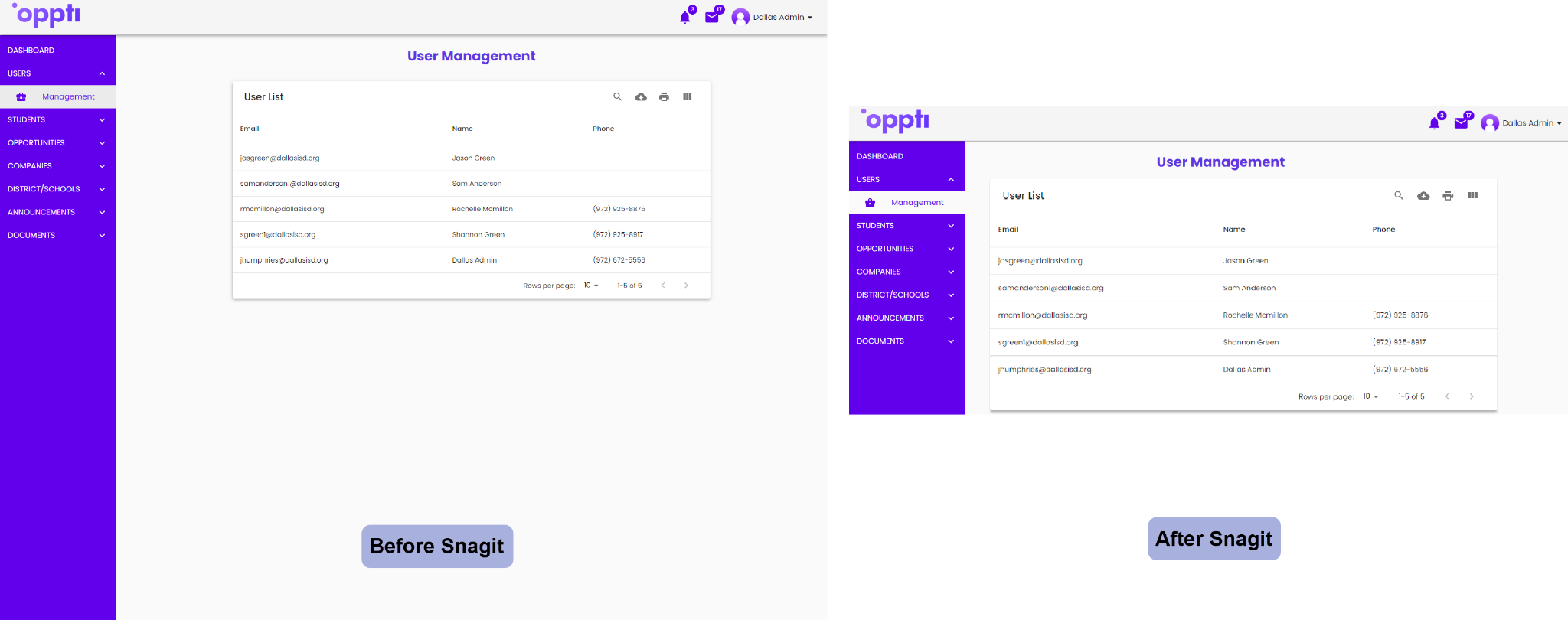
I broke the design process down into different stages of creation, such as writing instructions, adding annotated screenshots, icons, and images, stylizing text, and including appendices. I explored the Oppti platform by clicking every button, icon and link, and visiting every page to see where users could potentially run into issues. I created user-friendly instructions with screenshots when necessary. Using the software Snagit, I captured screenshots, added arrows, and manipulated images to make it easier for the user to understand (e.g. delete extra whitespace or enlarge the platform’s buttons to make it easier to read).
- Mentor Meetings
I met weekly with my mentor, Cecil, to review the project’s status and plan the next steps. I would explain what I had designed or developed for the week along with any challenges I faced. When presenting my work, I had to justify each design decision before receiving feedback. For example, when instructing a user to click a button, I formatted the font as bold, stylizing it the same way it appeared on Oppti’s user interface to make the reference as clear as possible.
I would defend my design choices by citing research, best practices, and style guides from leading tech companies. For example, I applied the Spatial Contiguity Principle discussed in Richard Mayer’s Applying the Science of Learning and placed text and related images adjacent to each other.
The entire project resulted in a 24 page manual which I completed in the span of 10 weeks, with 2–4 hours of development each week, not counting meetings. In total, the project took about 40 hours.
- Meeting the Stakeholder
Before delivering a draft of the manual, I had the opportunity to meet with Khiry, Chief Operations Officer and co-founder of Oppti. The meeting was scheduled as a chance to show Khiry the draft manual, as well as ask any questions I had. Meeting with the stakeholder provided a better picture of what his expectations and needs were for the manual, as well as a clear understanding of how the platform worked. I was able to fully understand how the manual would be used by his clients and clarify specific functions of the website.
I walked him through each page and he was able to ask questions to learn more about what I had done, and why. Khiry appeared to like the draft I presented to him and we set a deadline for the final version.
Challenges
Along the way, one of the bigger challenges was having limited access to a subject matter expert while working in an imperfect test environment. Because I did not have access to an expert and there were no demonstrations of the platform while I was creating the manual, I had to be methodical in exploring the test environment. Whenever something did not function how I expected it to in the test environment, I made a note.
While the test environment was reasonably representative of the live production, it was never perfect as the company pushed constant updates to the platform instead of working on a predictable sprint schedule. I’ve learned that having a test environment is often a luxury in the instructional design field and is never perfect. As changes were made, I learned to adapt and update anything I wrote.
After many iterations and tweaks, I finally completed the manual. The styling of the text, including colors, boldness, and capitalization, had been scrutinized and approved.
An Extra Bonus for the Stakeholder
Once the content of the manual was complete in Google Docs, I decided to create a more visually-appealing version of the manual using InDesign. I focused on layout, playing with colors, borders, alignment, and spacing.

I met with Khiry once more and showed him the finished manual. He was happy with the end product, expressing how it was a polished product that would benefit his clients’ interaction with the Oppti platform.
Although I was handing the product off to Oppti, I knew there would be plenty of future changes, so I also created a job aid explaining how to update the document in InDesign. Because Khiry mentioned that his company wasn’t currently using InDesign, I made sure to create a job aid that a novice user could understand. It included instructions with annotated screenshots demonstrating how to use the most important InDesign tools and features.
Results & Reflections
I gained a lot of insight in the field of instructional design with my first formal project, the Oppti District User Manual. I was able to leverage my design background and human-centered design thinking, but nurtured a new respect for the importance of every detail that came with instructional design. In my everyday life, I began viewing things differently: how I worded emails for work, the accessibility of a shopping website, and even the directions on my shampoo bottle.
Not only did I learn how to apply best practices and design instruction, I also learned how to collaborate with a real client to create an instructional design product with real-world constraints, an opportunity that is hard to come by with school projects.
While intimidating at first, this project was a great introduction into the instructional design world, and I gained valuable experience working with a stakeholder as well as a mentor. I am eager to take on the next project and learn even more!